

Anyone with even a passing interest in markets can make a list of 2022’s “top” macro themes.
The visuals that might accompany such a list would depict about what you’d expect: Inflation, labor shortages, commodities volatility, rate hikes, tighter financial conditions and so on.
Most Wall Street banks made such lists this month and published visual recaps of 2022, easily the worst year for humanity since the year before last (that latter bit is dark humor).
It’s worth highlighting a few charts from Goldman’s “top 10” list, I think. Those steeped in the macro narrative won’t learn anything new from anyone’s year-end chart compilation, but Wall Street does a good job of visualizing granular details.
The figure below, for example, shows how each region contributed to the post-pandemic surge in inflation by way of a stacked bar chart of “surprises,” defined as the deviation between YoY headline inflation prints and Bloomberg consensus.

Note that inflation across locales surprised almost uniformly to the downside during the last month covered by the chart (November, presumably). That offers some hope headed into 2023.
If you followed the commentary and news flow around hiking campaigns in what I’ve described as real estate “bubble locales,” you’re acutely aware of the extent to which policymakers in Australia, Canada, New Zealand and Sweden were compelled to chance an outright property meltdown (as distinct from a property correction) in the service of fighting inflation.
Housing market dynamics in those countries differ in important respects from the US. Many of those differences make aggressive policy tightening more dangerous for homeowners relative to the impact of Fed hikes on US homeowners, most of whom enjoy the certainty that goes along with, for example, a fixed-rate for the life of a mortgage.

It’s no surprise that Australia, Canada, New Zealand and Sweden score highest (or maybe “lowest” is more apt) when assessing the risk to GDP from a property downturn, as shown in the right pane of the figure above.
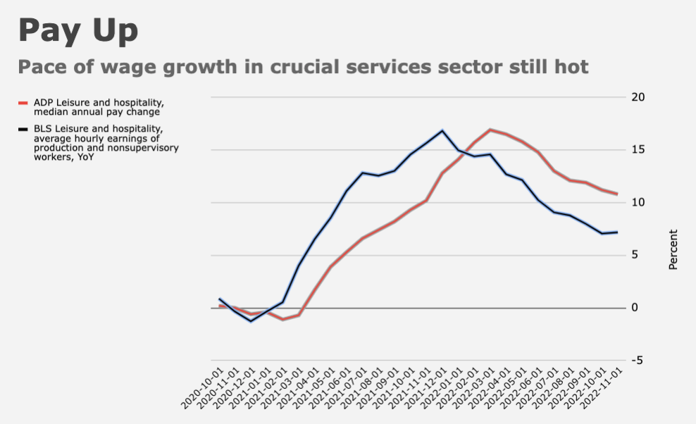
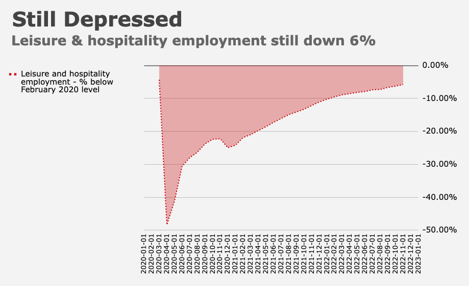
The trajectory of monetary policy in the US in 2023 will depend in no small part on the services sector. Consumer spending has shifted back to services, which is good news for a continued moderation in goods inflation, but bad news in the context of the dreaded wage-price spiral, which is either nonexistent or spinning out of control, depending on who you care to consult.
Note that consumer spending in the services sector still hasn’t reached its pre-pandemic trend. The charts (below, from Goldman) give you a sense of where things stand in that regard around the world.

As Alan Blinder wrote in his recently published “A Monetary and Fiscal History of the United States, 1961–2021,” “spending on consumer services… came back agonizingly slowly. In previous business cycle downturns, consumer spending normally held up well compared to, say, business investment and housing, and spending on services barely declined at all. In 2020, however, many service jobs that we thought of as non-cyclical suddenly disappeared.”
There’s no mystery there, of course. The nature of the shock (an airborne pathogen) made the services sector particularly perilous from a public health perspective. Recall that in the US, the leisure and hospitality sector still hasn’t recovered to pre-pandemic levels of employment.
Finally, note that inflation’s presumed (but not guaranteed) return to levels consistent with pre-pandemic price growth in the developed world may be delayed by de-globalization and the energy transition.

The figures (above from Goldman) are a good example of the kind of granular visualizations that can be useful for those who appreciate efforts to quantify big picture themes.
At the end of the day (or, in this case, the end of the year), there’s really only one thing we can say with any degree of certainty. As Goldman put it, “All of this is a good reminder that this cycle is likely to be different.”


Thanks for a year’s overflowing stocking full of insight, inspiration, instruction, and entertaining delivery of commentary on the many lumps of coal 2022 has offered. Wishing you all the best for Christmas and search for a new home and all else in 2023!