

Markets are currently transitioning from “hope” to “growth,” Goldman’s Peter Oppenheimer said, in a new note that echoed many of the themes regular readers likely know by heart.
Equities pull forward future outcomes or, more precisely, expected future outcomes. They (stocks) don’t know what the future holds any better than the people and machines trading them do. After all, prices reflect nothing more than an agreement between a buyer and a seller, neither of whom are fortune tellers.
With that caveat, Goldman’s Oppenheimer noted that because equities discount future cash flows, recoveries from recessions are often more lucrative for investors than the realization of a stable, healthy economy. “The ‘journey’ typically generates higher returns than the ‘arrival,'” as he put it, distinguishing between different phases of a cycle (figure, below).

The “Hope” phase is “typically short” and defined by multiple expansion, Goldman went on to say, whereas the “Growth” phase is (much) longer, and usually features “lower returns and lower valuations” because investors priced in the expected improvement in fundamentals during the previous phase.
Normally, the “Despair” phase lasts 16 months. This time, it lasted just six weeks.
Goldman emphasized the obvious — namely that “market returns during the ‘Hope’ phase of this cycle, over the past year, have been unusually strong, exceeding the typical rebound from bear markets and even outpacing the powerful rebound over a similar period following the global financial crisis.”

Typically, price returns during the “Hope” phase are around 44%. By contrast, the S&P 500 staged one of the largest YoY rallies in recorded history from the March 2020 bottom (figure above).
That “Hope” was more powerful following the pandemic than the financial crisis is particularly “striking,” Oppenheimer said, given the depth of the GFC bear market. This cycle, he remarked, is “unusually strong.” Or at least it has been so far (figure, below, from Goldman).

On Goldman’s estimation, this cycle’s “Hope” phase lasted through January. From the depths of the pandemic panic (in March of 2020) through early this year, stocks rose some 73%, while the trailing multiple (for global shares) expanded by 108%.
Obviously, profits have rebounded. Q1 earnings season in the US, for example, was a blockbuster. The pace of bottom-line beats was remarkable (figure below).

But, as discussed here at length on a number occasions, the market reward for beats was just half of the historical average. That, Goldman reckoned, is indicative of a transition to the “Growth” phase.
What, exactly, does all of this entail for equities going forward? Well, lower returns, for one thing. Goldman’s Bull/Bear Market Indicator isn’t flashing “amber” (i.e., >70%) just yet, but it’s yellow (figure below).
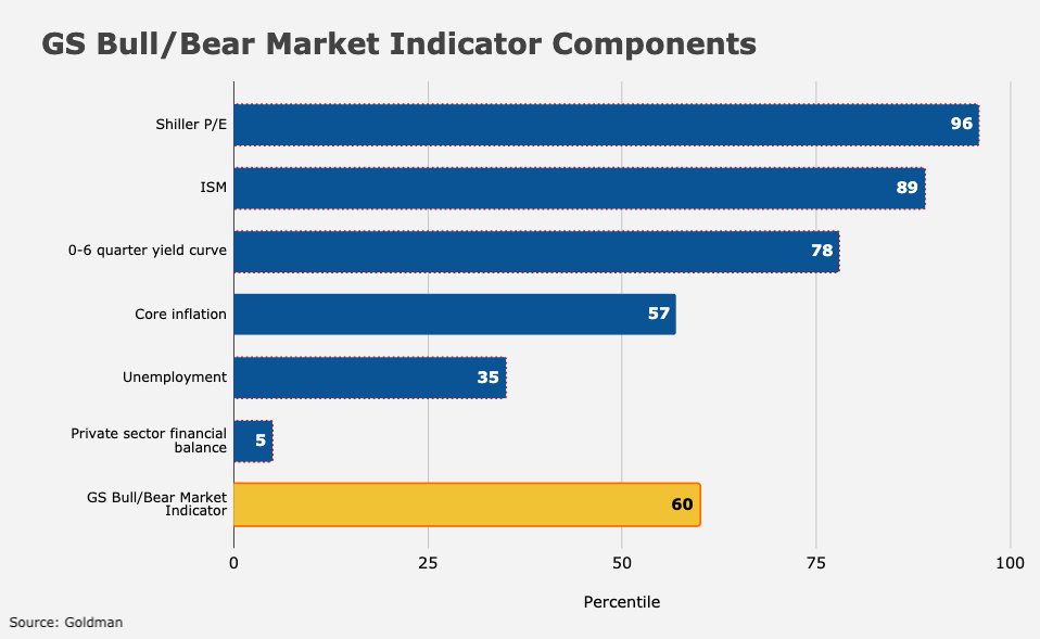
“The factors that are preventing the indicator from rising sharply are unemployment (still high and consistent with lower wage pressures and excess capacity) and private sector savings, which remain very high (and so reduce the risks of deleveraging and systemic risks from any stock market weakness in the short term),” the bank’s Oppenheimer wrote.
So, while the risk of a bear market or a prolonged selloff are (relatively) low in Goldman’s estimation, returns may be “much lower” from here, or at least at the benchmark level.
When the bank’s Bull/Bear indicator was at 60% historically, 12-month forward returns for the S&P averaged around 7%, going back to 1955.
The message: “Hope” might “float,” but “Growth” tends to trudge higher in less euphoric fashion.


Good post!
Thinking generically about the characteristics to select for in these successive phases.
Imagine if you only knew 4 things about stocks, and it was all historical (no forecasting): 1) price, 2) balance sheet, 3) return on [equity, assets, invested capital], 4) growth.
I posit that in the earliest phase of a recovery (aka early cycle, aka “Hope”) you want to select for 1) [large price decline] and 2) balance sheet [debt as % of enterprise value much greater than pre-crisis]. As the recovery progresses to the next phases you want to shift selection to include 3) [higher returns] and 4) [higher growth]. In the later stages of the cycle you want to emphasize 4). Finally, as the latest state of the cycle (say, when yield curve inverts) appears you want to revert to 2) [now looking for debt % low] and 3) [high returns].
More about this later . . . gotta hop
The above is a framework I’ve used through the last couple of economic cycles. As suggested by the chart in H’s post, this cycle bears some similarities to the GFC cycle. We are sort of in early 2010. Cycles differ, of course. I don’t recall any analogue in the GFC to the “pandemic winners” and “vaccine” stocks of 2020, and the scale of monetary and fiscal action now has little parallel in 2009. Nevertheless, I think the broad framework holds.
We are now, I think, nearing the end of the first, “Hope” stage. So selection criteria should be shifting to include 3) and 4).
Finally, look at the SP500 charts from 2009 on. The market rally did not end in early 2010, though it was interrupted around April/May. We could have such a slump this year, and if so it won’t mean this market rally has ended.
I would be thrilled with 7% the next 12 months.