

By the end of jobs week in the US, market participants were still asking the same general question: Are equities a bubble?
Nobody knows for sure. Because there’s no set definition of “bubble” in this context. But Miller Tabak’s Matt Maley knows one thing for certain. There’s “a decent amount” of “froth” in markets. That means next week’s a good time to raise cash, according to remarks quoted by Bloomberg.
The more specific bubble questions revolve primarily around market concentration, and the extent which the rally owes everything, or damn near everything, to the “Fantastic Four” or the “Magnificent 7” or the top 10 stocks (I’m not sure what the superhero name for 10 of something is — the “dazzling decad” maybe?).
In a note that garnered a bit of attention (where that means a mention or two), Goldman rolled out some familiar statistics in the course of assessing market concentration and associated risks. The 10 largest US stocks are a third of market cap and a quarter of earnings by now.

The figure on the right, above, gives you a sense of the lopsided return attribution. Just 2% of the market (i.e., the top 10 stocks) comprised a third of returns in each of the last five years.
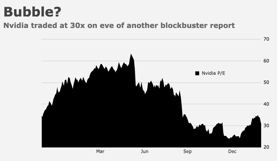
By now, the valuation story is well-worn to the point of exhaustion. Multiples for the top stocks are elevated but not to the extent they were during the dot-com bubble or during the COVID bonanza or really even midway through last year on a forward multiple (remember: Nvidia actually became considerably cheaper as it ran higher given the remarkable increase in profits and profit expectations).
The top 10’s valuation premium to the rest of the market (around 35%) is 70%ile on a 40-year lookback, Goldman noted, below last year’s high and nowhere near the dot-com-era premium. Market cap concentration, as measured and illustrated in the left-hand figure above, is higher than 2000 and 1973, the two ostensible analogues bubble spotters like to reference. But, again, multiples are lower versus 2000 and the heavyweights boast better margins and ROE compared to the top stocks in 1973 or during the dot-com boom.
The figure below uses a Fama and French measure extended back to 1920 to get a larger sample.

On the surface, that presents a somewhat disconcerting picture: The market’s as concentrated as it’s ever been looking back a century.
The good news is, not all of the peaks denoted by the annotated light blue dots presaged a crash. “The relatively recent episodes of elevated concentration that occurred in 2009 and 2020 coincided with sharp positive shifts in the macroeconomic outlook [and] peak concentration in 1932 marked the bottom of a major economic downturn, with [stocks] rising sharply in the subsequent months,” Goldman’s Ben Snider remarked.
That said, he was quick to point out that there are “clear similarities” between the current macro-market landscape and that which persisted during the two bubble analogues in 1973 and 2000. Unemployment’s low and concentration’s “rising alongside strong equity market returns,” Snider said. “In each of those episodes, the peak of equity market concentration also marked the peak of a bull market, and the economy entered recession with the subsequent year.”
But don’t fret too much. Because, as Snider went on to say, “the 1964 experience shows that an ongoing bull market can continue to move higher even as market concentration declines.” He quoted a 1964 article in The New York Times.
“One of the sources of real internal strength for this prolonged upward move has been group rotation — the shifting of prime investor interest from one industry group of stocks to another,” the Times said, 60 years ago. “As investors tired of one group of stocks, there was always another group — or various groups — to attract attention and lead the market, with scarcely a ripple of hesitation in the upward oscillation.” It’s amusing how our language evolves, no?


